Fergusons Downtown
Brand Identity, Graphics, Website Design
Fergusons is a downtown market square, rooted in community, celebrating music, art, nature and local creators. Through the revitalization of the historic Fergusons Motel, their mission is to cultivate a diverse and inviting community that fosters creativity and passion. From the shops of local makers to restaurants and an enchanting green space, Fergusons is a place where you can connect, shop, sleep, eat and explore.
Fergusons Branding
Fergusons needed full-scale branding from the ground up to establish their visual identity and online presence. An integral part of downtown Vegas, the sign has been preserved in both the motel renovation and our brand vision. Bright and welcoming, the colors were taken directly from the Fergusons sign and the magenta flowers that grow around it.
Market in the Alley
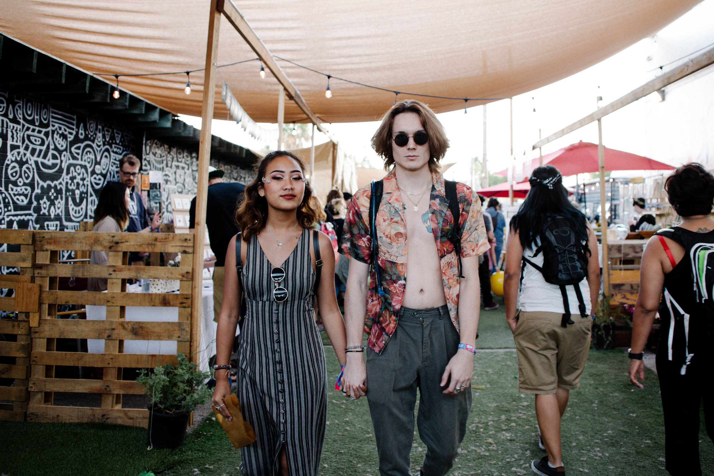
Fergusons is not only a part of the community, but a catalyst for artists and creators to come together during their music and market events.
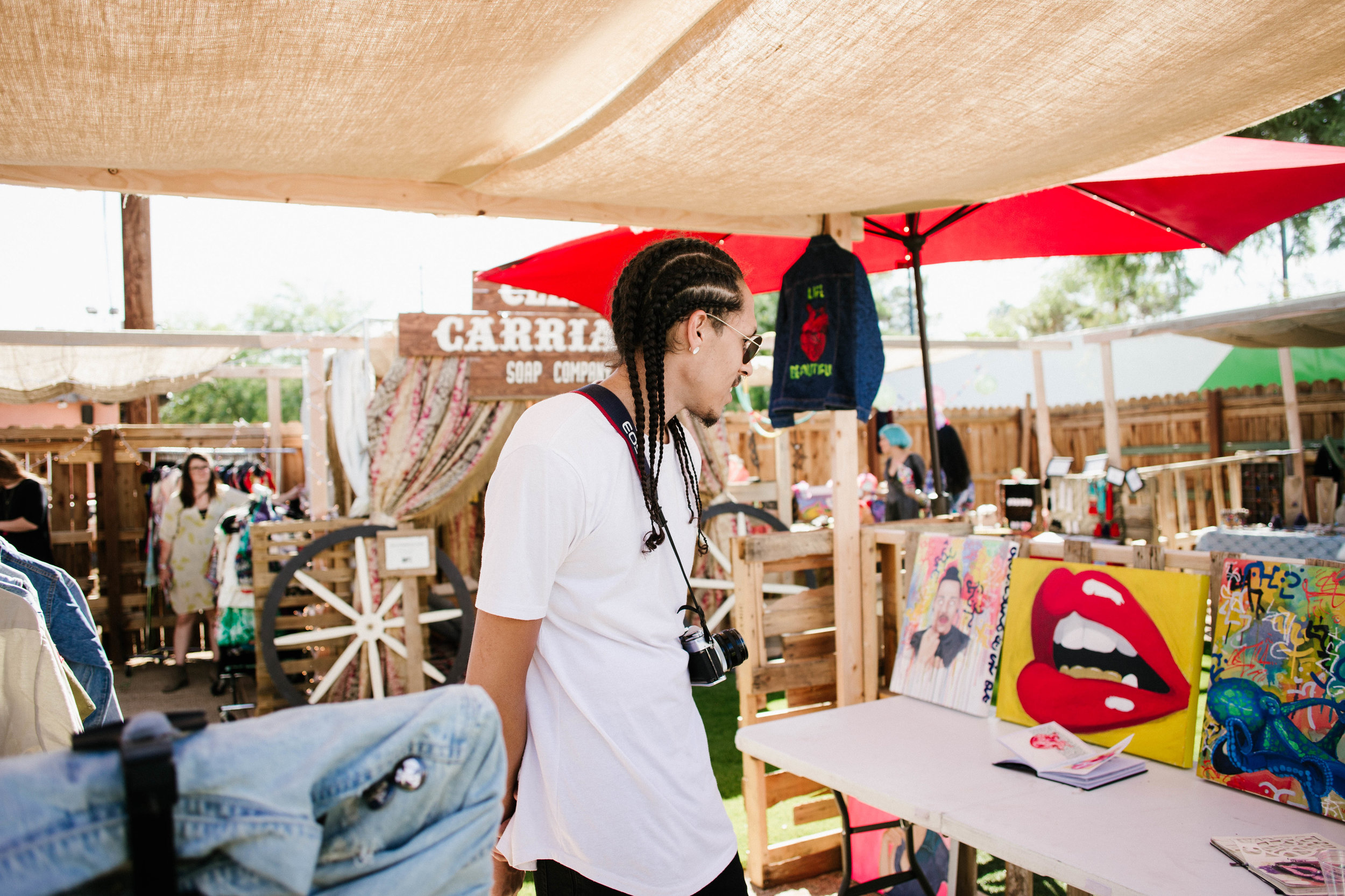
Once a month, Fergusons hosts the Market in the Alley, where local creators display their products - art, jewelry, tarot readings, and everything in between - and interact with community members.
print & digital collateral
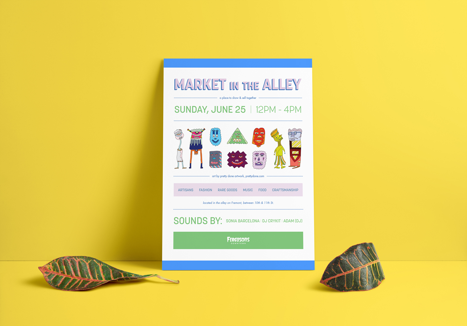
Through our months of working with Fergusons, we designed posters and social posts calling for community participation. While all commonly exude a vibrant energy, these posts were designed with a flexible style to ensure that the brand could easily work with local artists in a wide array of styles and mediums.
* "We All Need Each Others" (top right) and poster characters (left) illustrated by prettydoneartwork.
Business cards are often tossed, so we created stickers instead (below). Showing the iconic sign, they became decoration instead of recycling.
Website
Fergusons needed a simple one-page website to direct their audience to the events they were hosting. We worked with their developer to create a clean, colorful site that would be easy to understand and maintain, highlighting their community initiatives.
